Outsider Art Fair Rebranding

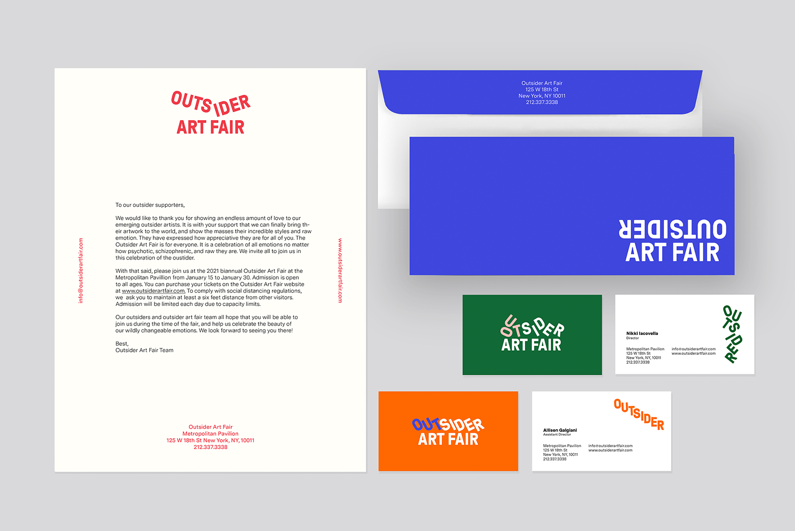
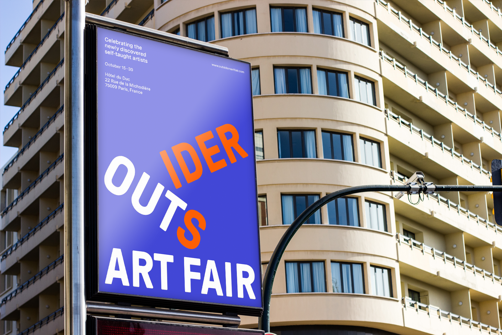
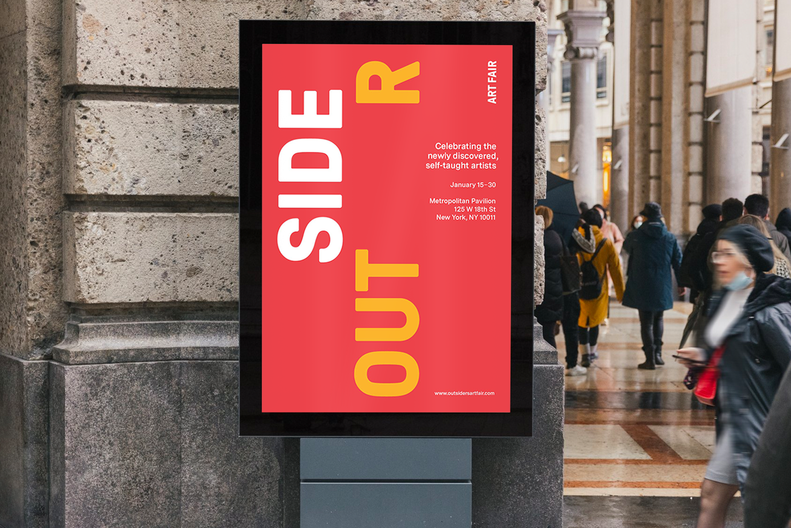
The Outsider Art Fair is a biannual premier fair dedicated to Outsider Art. Outsider artists are visionary, psychotic artists who are the difference between “inside out” and “outside in” thinking. I created a brand system for the fair that conveys the extreme emotions outsider artists experience in a fun playful manner.
Mark
Mark

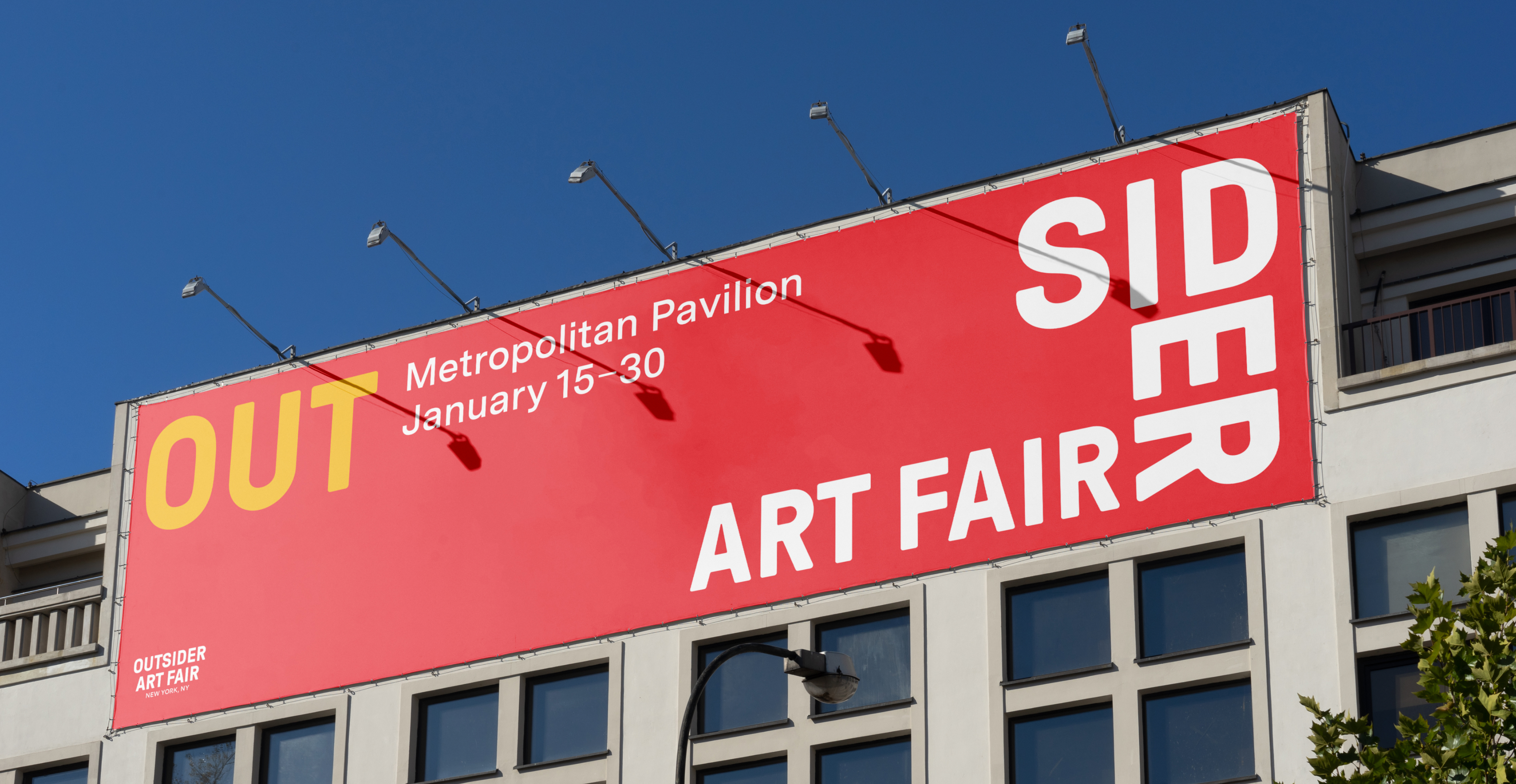
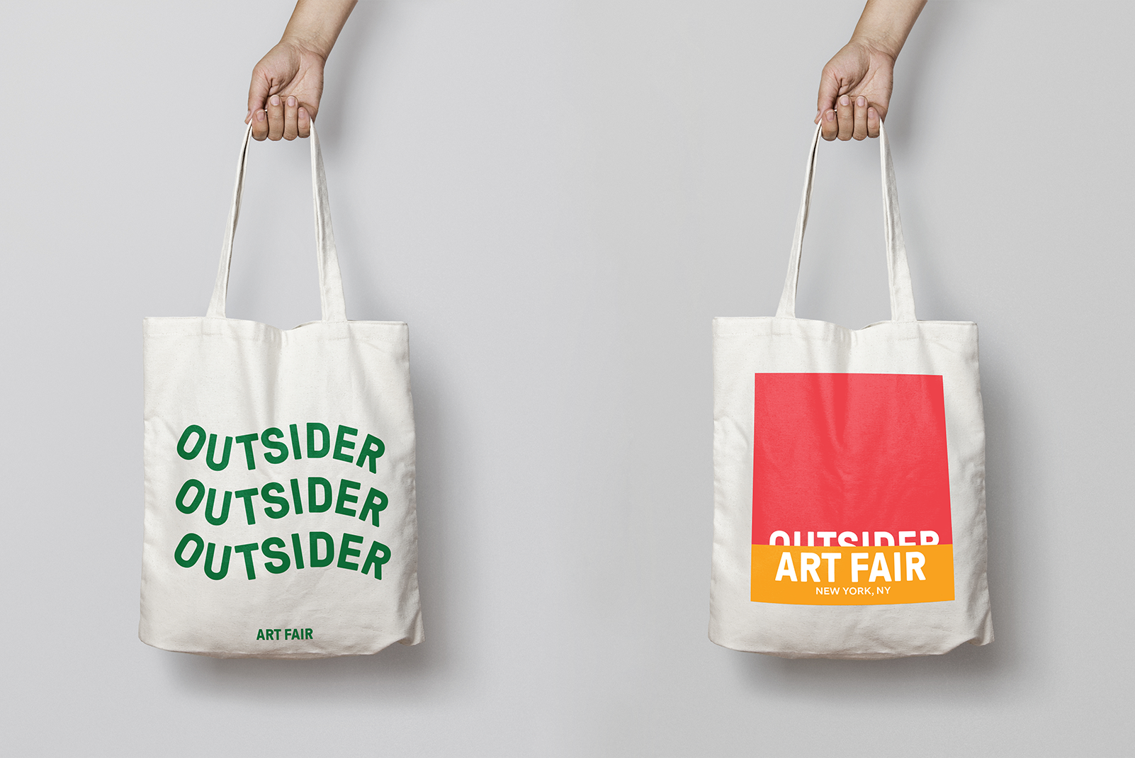
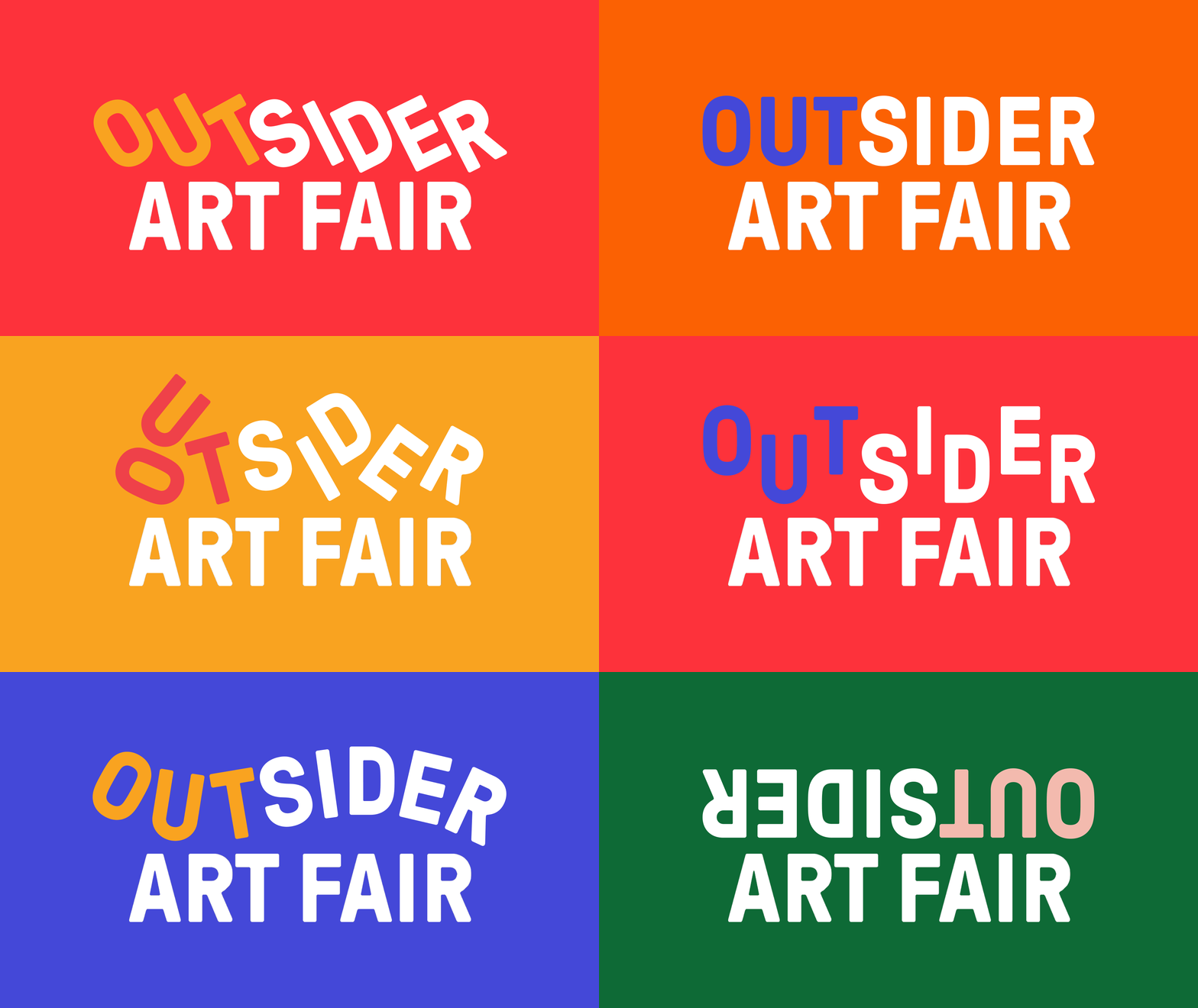
The identity as a whole stems from the extreme emotions outsider artists experience portrayed in a fun, playful manner. I wanted to depict the wildly changeable nature of their art with the use of an interchangeable wordmarks and color combinations. In each wordmark, the ‘out’ is highlighted in a different color to place emphasis on the outside way of thinking.
Mark

I designed a custom set of icons based on the main typeface, GT Pressura Pro. 


sdfsdfs
Mark

I designed a custom set of icons based on the main typeface, GT Pressura Pro.


sdfs
Mark

Mark


Mark

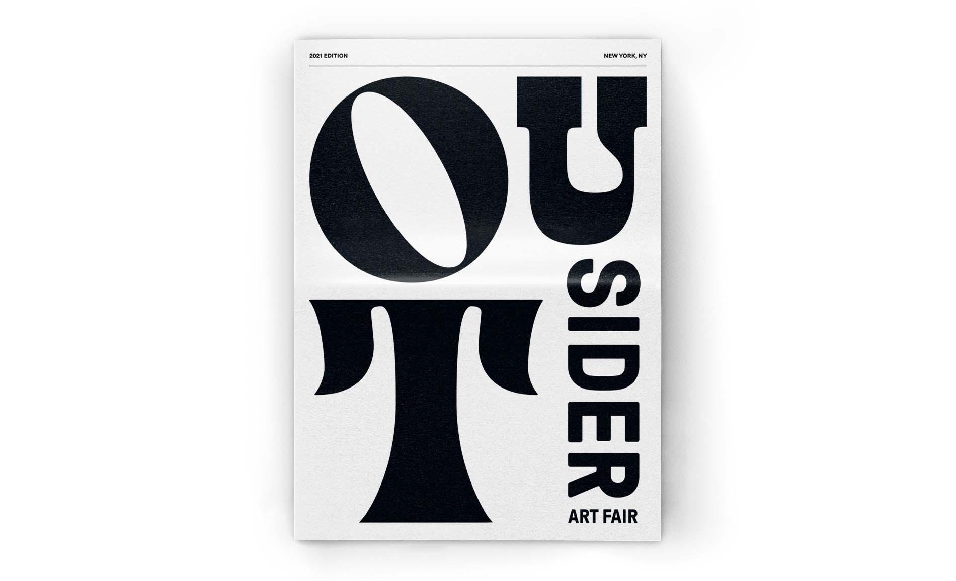
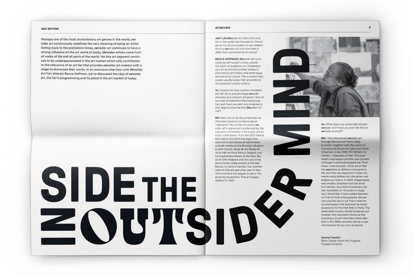
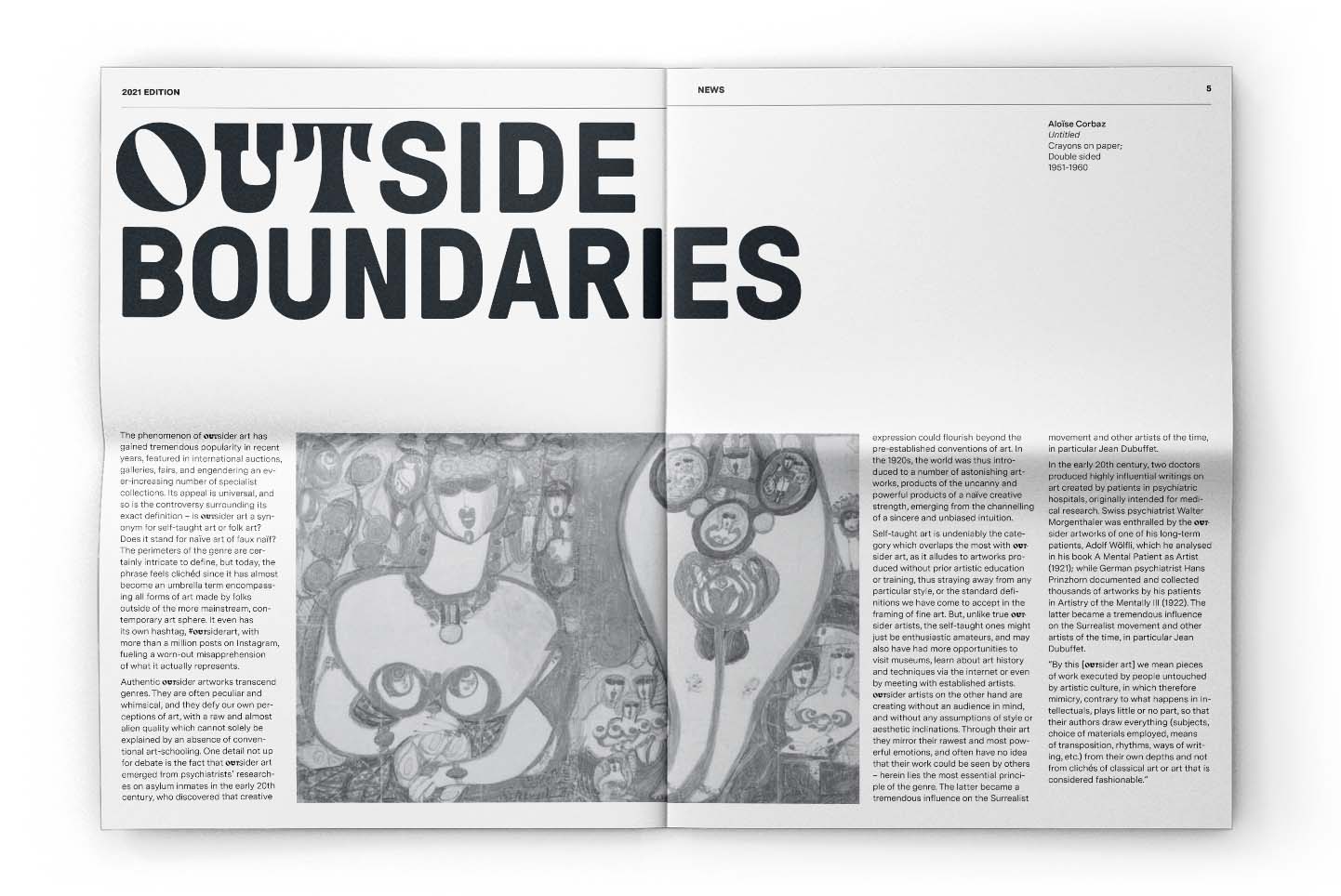
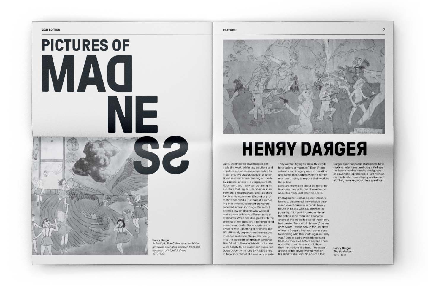
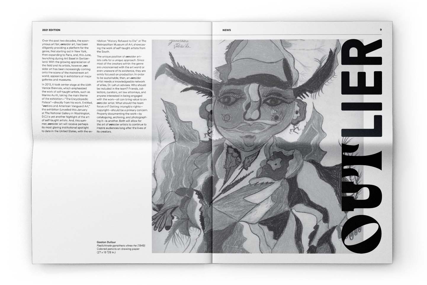
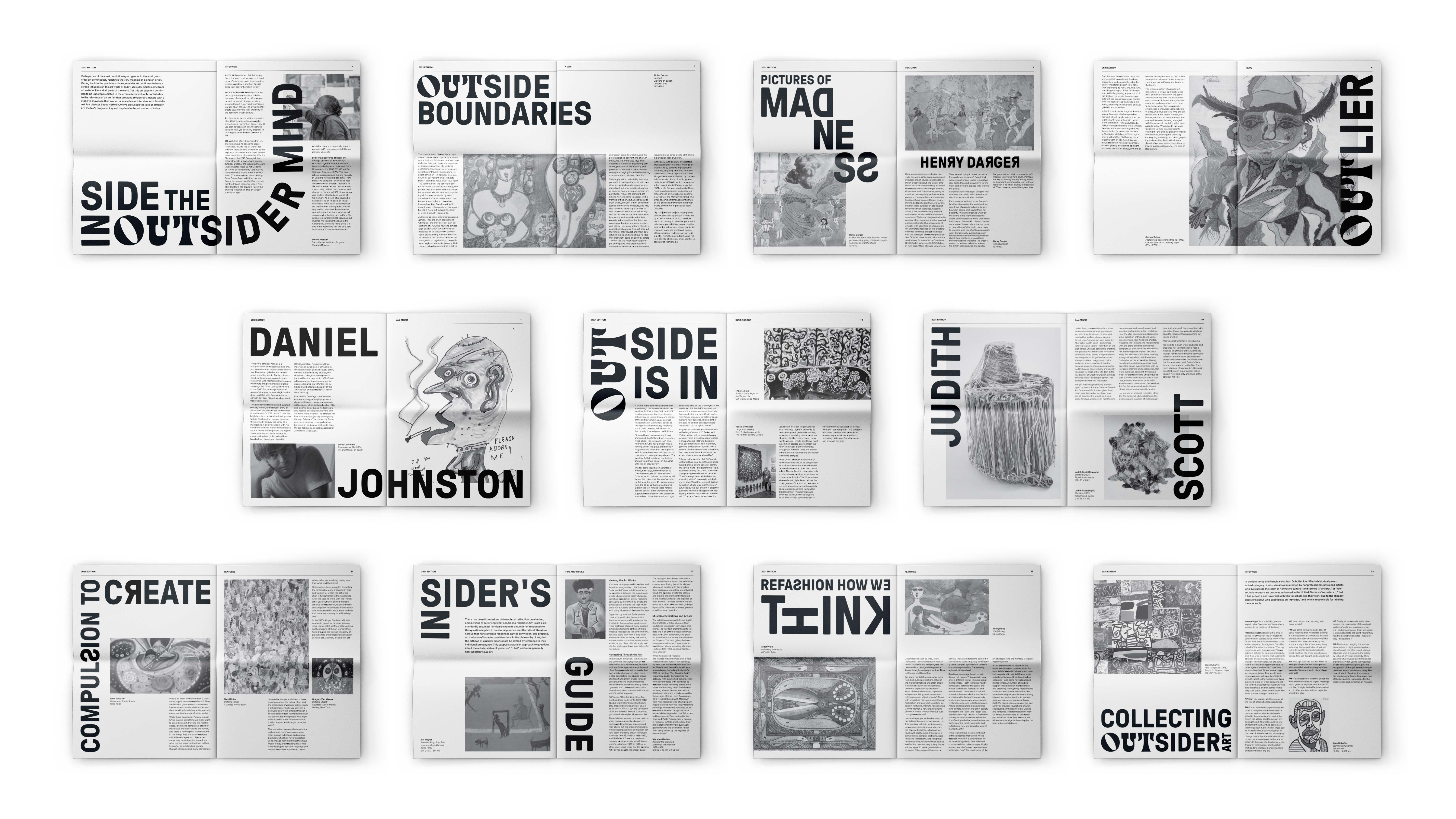
Outsider Art Fair Editorial

The Outsider Art Fair newspaper is a keepsake that vistors can look back on. Utilizing a traditional black and white color scheme, it places emphasis the ‘out’ in various typefaces to replace the usage of color within the main branding elements. 


Mark

Outsider Art Fair Editorial

The Outsider Art Fair newspaper is a keepsake that vistors can look back on. Utilizing a traditional black and white color scheme, it places emphasis the ‘out’ in various typefaces to replace the usage of color within the main branding elements. 


Mark


Mark

Details

Functions

Brand Identity
Editorial


Design Team

Kristin Lee


Date

March 2021 – April 2021


Mark

Details

Functions

Brand Identity
Editorial


Design Team

Kristin Lee


Date

March 2021 – April 2021


Mark


Fun. Crafty. Innovative.


Fun. Crafty. Innovative.


A creative both on and off the screen


My passion for design first stemmed from creating paper art. Whether its 2D or 3D, I enjoy being meticulous and building things with my hands. 


Focusing on handcrafted objects allows me to roll away from the computer when I need a break. Paper inspires me for its versatility, range of colors, and infinite methods of innovation.


Mark

A creative both on and off the screen


My passion for design first stemmed from creating paper art. Whether its 2D or 3D, I enjoy being meticulous and building things with my hands.

Focusing on handcrafted objects allows me to roll away from the computer when I need a break. Paper inspires me for its versatility, range of colors, and infinite methods of innovation.


Mark

Mark
© 2023 Kristin Lee
© 2023 Kristin Lee